Color Combinations Explained
Let’s Talk Color!
It’s good to know the three types of color combinations when coming up with a good combination of colors for a website. The same is true for marketing materials, social media posts, and other business related content. Triadic, analogous, and complementary. These are the color combinations used all the time for websites, marketing materials, images, and more. So what does each one mean?
Red Website Color Combinations
We will be using red for our examples. The hex code for this red is #FF0000.
Triadic Colors
Triadic colors are three colors that are evenly spaced out on the color wheel. The two best examples of these are primary and secondary colors. The primary colors being blue, red, and yellow. The secondary colors being purple, orange, and green.

Analogous Colors
Analogous colors are three colors next to each other on the color wheel. Generally, these are based on one main color, a primary (blue, yellow, red) or a secondary (green, orange, purple). Often, a two color analogous combination is used along with one other color that pops as an accent. For more in-depth information on analogous colors, check out this article.

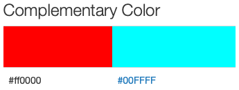
Complementary Colors
Complementary colors are two colors that contrast with each other. The contrast is extreme. Therefore, the colors appear brighter and “pop” on the page.

Determining Which Colors to use
Deciding which color combination to use on your website can seem daunting. However, many organizations go the easy route. For example, simply using the dominant color from a logo as a jumping off point works great. From there, look up the triadic, analogous, and complementary colors to incorporate as well.
Where Can Color Codes be Found?
These color combinations can be found on a variety of websites. But on site I really like is color-hex.org. The site is easy to use, easy to search, and gives color codes in a variety of formats to be used across the web and other applications.
How can color codes be used?
Shades of your main color can be used for different backgrounds and other minimalist elements. Complementary colors are great for pieces of the site that need to stand out, or really pop. And the analogous colors are great to use as the main three for your site. They work well together in a variety of ways and look great next to each other.
have fun!
Finally, the right color combination makes setting things up fun. Choosing a good color combination means you can use them in a variety of ways across all your website and other materials and they will look good together.
Create materials using the colors in different areas, closer and further from each other, and try different shades. Try giving things a little more pop than usual. The difference great colors can make is amazing!
Happy Coloring!
Need assistance determining a good color combination for your website?
Get in touch with us today!


