Does being mobile-friendly really matter?
Does being mobile-friendly really matter?
In one word… ABSOLUTELY! With nearly 50% of all internet traffic worldwide being from mobile devices, having a responsive website is super important. A mobile-friendly website can really help keep your audience engaged and wanting more.
Responsive websites are awesome! However, it can be difficult to get there. The three things I have encountered quite a bit recently that make sites non responsive are: CSS issues, images, and popups.
CSS is fantastic when situated properly. But it can be difficult to make elements on a page do as intended and have them look right on a monitor and a phone.
Images on mobile devices can look really great, or pretty bad. Sometimes images don’t change the way you expect them to when going from a monitor to a mobile device. Edges can be cut off, height can change completely, or the images could just be somewhere else on the page entirely.
Popups can be extremely useful for generating new leads and opportunities. But if that popup displays incorrectly mobile – say, the “x” to close isn’t clickable – it can completely turn someone off.
Don’t lose your audience and potential customers because of an unresponsive website!
Why is CSS so frustrating?
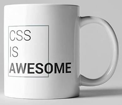 Many people have seen this mug before. It’s 100% the truth. And while CSS is getting better every day, working with it using a monitor alone can cause serious headaches. While working on a site, especially with CSS, it’s important to check your progress on mobile fairly regularly.
One line of bad CSS can throw everything off – and unfortunately, so can trying to fix it. CSS can be a tough cookie, but there are some great websites (w3schools.com is one of them) out there that are updated all the time.
If you’re a CSS novice, take your time and work through things slowly. Take a look at each change you make to see exactly how it makes things move around the page. There’s a learning curve to everything, and CSS is no different.
What is going on with my images?
Wow, check this out – it looks perfect on my monitor!

What happened? It looks horrible on my phone!

Images can be tricky
Images are one of those things that can be a bit of a pain to work with online. The issue can be anything from a button not clicked or alignment not correct, to updates needed or CSS from who knows where having a negative effect on the element.
People tend to skim content when reading on their phones. Having images that are just way too big, not mobile-friendly, and force more and more scrolling to reach content can be frustrating for the reader.
How can I fix bad images mobile?
Good news and bad… the good news is you can always hide images mobile. Unless your site is all about the images (photography, for example), you probably don’t need as many mobile as you think you do.
The bad news… if you don’t want to hide your images, you’ve got some serious digging to do. You need to uncover what’s causing the problem. Oftentimes, when an image is fixed mobile, it not longer looks right on a monitor.
Check for updates, check all your settings, it’s really a game of hide-and-seek with the issue.
my popup doesn’t work mobile
Popups, whether they be ads, contact forms, or just informational, can be amazing tools to use on your website. But if a popup doesn’t work right, it can hurt you in the long run.
Why Won’t my popup close?
There are many issues that could happen with popup windows mobile. The one I’m going to mention here is the “X” to close either not being clickable, or simply not being there at all. This can be frustrating to your audience, and if someone can’t get a popup window to close, odds are that person is leaving your site – possibly forever.
Any time you add a popup window to your website, check it on all mobile devices. If you can’t see the “X” on your phone, your visitors won’t be able to see it either. If the popup window scrolls, make sure the scrolling works while keeping the button to close it in view.
How can I fix my popup not closing?
Like many other things on websites, check your settings. There could be different settings for the popup window for large screens versus smaller ones. Sometimes the fix is simple – the color for the “X” to close the popup window mobile has its own color settings, and it was set to be the background color. Other times, it’s more complicated. CSS could be inhibiting the close button from working, or moved it somewhere it can’t be seen mobile.
The best thing to do is test, test, test. Always test things as you’re doing them – both on large screens and mobile devices.


